Maturity Gap
Young adults, the legal system, and the data between them
An adult at 18. A number that changes everything: which court hears the case, which facility takes custody, whether a record follows case closure. The line is exact, but the people crossing it are not. And it wasn’t drawn because 18-year-olds present any noted difference; the age of majority is a legal definition, not a biological one.
The line at 18, as it turns out, is younger than it looks. For most of American history the age of majority sat at 21, inherited from English common law; twenty-one is also the age the Fourteenth Amendment wrote into its voting provisions. Following the war drafts of WWII and Vietnam, public and political sentiment shifted toward voting at 18, the same age a person could be drafted to war. Congress proposed the 26th Amendment in March 1971, the states ratified it by July, faster than any amendment before or since, and most states soon lowered their age of majority to match.
Each section below asks one question about young adults in the legal system and answers it with a chart picked for that job. Most of us pick charts the way we pick fonts, by habit. So each figure carries a short note on why its form won. The argument reads fine without the notes. The habit may not survive them.
The Frame
What does the field believe happens between 12 and 30? Supports build, risks fade, and arrests rise and fall across the same window. I drew the two curves together: the arc of growing up laid over the curve of desistance.
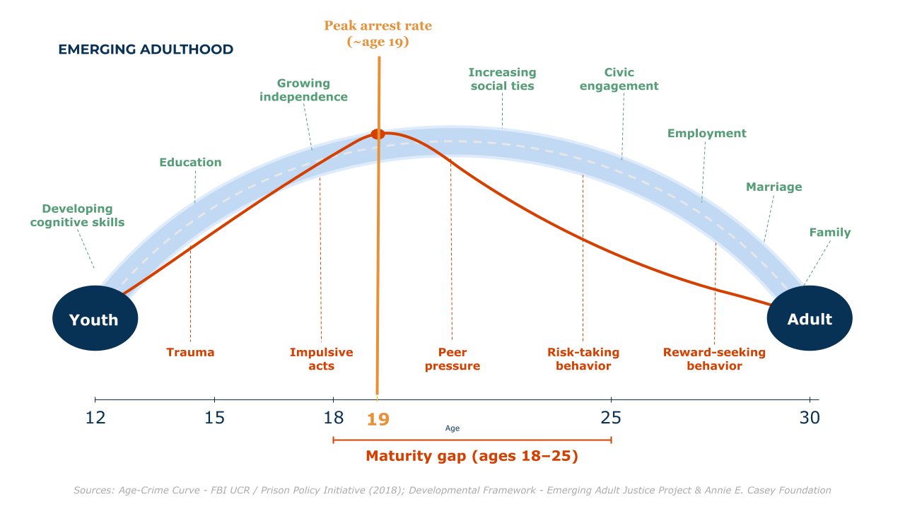
Arrest rates peaked near 19 in the years this story covers: in 2010, more Americans were arrested at 19 than at any other single age. Sources: FBI UCR arrest data via the Prison Policy Initiative and the Bureau of Justice Statistics; developmental framework from the Emerging Adult Justice Project and the Annie E. Casey Foundation.
Why this chart: a diagram, not a data chart, because its job is to hold two ideas in one picture, not to measure them. Everything after this point is measured.
The Real Curve
Is the famous curve real? Here it is in arrest data: robbery arrest rates by age, drawn for three different years.
In all three years the rate peaks at 18, and by the late 20s it has fallen by more than half. Ages are plotted at bracket midpoints, single years to 24 and wider brackets after, which is what the FBI data gives. Source: Bureau of Justice Statistics, Arrest in the United States, 1990-2010 (NCJ 239423), figure 12 data.
Why this chart: a line chart, because the question is shape, and one emphasized line with gray context years shows the shape holding still while the level drops. Three equal lines would read as spaghetti, and spaghetti has no protagonist.
Everywhere in the System
How much of the system is this one age band? Ages 18 to 24 were about one in ten Americans, so count them at each stage.
Population and arrests are 2010, sentenced prisoners are yearend 2010, and prison releases (age 24 or younger) are the 2005 cohort. Sources: Census Bureau, Statistical Abstract 2012, table 7; BJS NCJ 239423, table 3; BJS Prisoners in 2010, appendix table 13; BJS NCJ 250975, table 1.
Why this chart: a dot plot, because four shares on one scale need aligned positions, not four bar areas. The dotted line makes the population share the ruler everything else is measured against.
The Revolving Door
Who comes back? Follow everyone released from state prison in 2005 for nine years, and split them by how old they were on release day.
People released at 24 or younger: 51.8 percent arrested within a year, 90.1 percent within nine. Released at 40 or older: 37.8 and 76.5. Source: BJS, 2018 Update on Prisoner Recidivism (NCJ 250975), table 3.
Why this chart: a dumbbell, because each age group has two linked numbers and the segment between them is the story. Ten bars in two colors would make the reader rebuild each pair by eye.
The Study
The charts above count young adults from the outside. To watch growing up happen from the inside, you need the same people measured again and again. That is Pathways to Desistance (ICPSR study 29961): young people enrolled in the early 2000s shortly after each was found responsible for a serious offense, then tracked across 11 interview waves over seven years.
1,354
people followed
11
interview waves
7
years of follow-up
14 to 26
ages observed
Why this chart: no chart at all. A chart needs a comparison to earn its ink, and these four numbers are context, not contest. Set them large and let them stand.
Maturity here means the Psychosocial Maturity Inventory, PSMI for short: a questionnaire scored 1 to 4, with subscales for self-reliance, identity, and work orientation. The overall score averages the three, and in this data it runs through age 24.
WarningWho Is in These Numbers
Everyone here was enrolled after a serious offense, in the juvenile and adult systems of two large metro areas (Philadelphia and Phoenix). This is not a portrait of all young people; it is the group the justice system actually handles, which is exactly where the line at 18 does its heaviest work.
The Curve That Keeps Climbing
Does maturity finish at 18? Line up all of the interviews by the age the person was when they gave one, and take the mean at each age.
The mean climbs from 3.01 at 14 to 3.15 at 18 to 3.35 at 24, still rising at the edge of the data. Sixty percent of the observed climb lands on the adult side of the line. For once, maturation is not a threat to validity. It is the finding.
Why this chart: a line with a band, because the question is trend and the band keeps the trend honest: it shows individual spread, not a confidence interval, and the note says so. The y axis is zoomed to the data; on the full 1-to-4 scale the climb would flatten, so the axis choice is itself a claim, made here in the open.
Four Measures, One Shape
Do the subscales tell different stories? Almost: identity barely moves before 18, then does most of its growing after, but nothing flattens at the line.
Growth after 18, as a share of each measure’s observed total: identity 83 percent, overall 60 percent, work orientation 54 percent, self-reliance 53 percent.
Why this chart: small multiples, because four lines in one panel would tangle and four panels sharing both axes make slopes comparable at a glance. The shared y axis is the whole trick, and it is only legal here because these four measures share a scale.
What Arrives After 18
Maturity is not one thing: the study also measured the capacities the law’s line is supposed to stand for, impulse control, temperance, future outlook, and consideration of others.
Impulse control climbs from 2.93 at 14 to 3.16 at 18 to 3.57 at 24; every panel shows the same late arrival. Future outlook is scored 1 to 4 and the rest 1 to 5, so compare ages within a panel, never scores across panels.
Why this chart: a slope chart in small multiples, because three ages per measure is a story about change, not a full trend. The panels get free y axes on purpose: forcing four different scales onto one shared axis would manufacture comparisons the data cannot support.
The Spread Inside Every Age
Means are tidy; people are not. Drop the averaging: each column is an age, and each cell shows the share of that age’s interviews landing in one half-point score bin.
At 18, scores spread from 2 to 4, and the spread within that single age (a standard deviation of 0.47) is bigger than the entire average climb from 14 to 24 (0.34 points). Blank cells are not zeros: any cell holding fewer than 10 interviews was suppressed before this page ever saw the data, a privacy promise made visible.
Why this chart: a heatmap, because the question is distribution and a heatmap shows every age’s whole spread at once. One sequential hue, light to dark, because the cells encode one magnitude; a rainbow here would encode nothing.
Same Climb, Both Sexes
Most of this cohort is male, 1,170 of the 1,354, so the curves above are mostly male curves. Split overall maturity by sex and ask whether the climb is a male story.
From 16 to 23 the male mean climbs from 3.06 to 3.27 and the female mean from 3.12 to 3.37. The 184 women are outnumbered more than six to one, so their line runs noisier, and their age-24 cell fell below the ten-interview floor and is suppressed.
Why this chart: two lines in one panel, because here the comparison is the question and both series share one scale. One line took a band, a pair shares a frame, and four went to panels: the series count picks the form.
One Cohort, Crossing
The study did not sample teenagers and adults separately; it watched one group cross the line. At the first interview, 92 percent of the cohort was under 18, and four years in, no one was.
At month 84 the band dips a hair below 100 percent: one person had aged past 25, and cells that small are suppressed. Ages at missed interviews are carried forward from baseline age plus elapsed time, so every wave counts all 1,354 people.
Why this chart: a stacked area, because the question is composition of a whole over time, and area is the encoding that makes the two bands visibly sum to everyone. The earlier charts used lines because their question was level, not composition.
The Gap, in One Picture
Put the two halves of the story in one frame. As this cohort aged from 14 to 24, the share who reported any offending fell while their measured maturity rose. The law’s line crosses both curves mid-climb.
Offending is the share of follow-up interviews reporting any of the survey’s offense list since the last interview (baseline is excluded: its recall window is not comparable, and everyone here was enrolled after an offense). The recall window lengthens at month 48, which can only push the later shares up, so the decline is, if anything, understated.
Why this chart: two stacked panels sharing one age axis, because a share and a 1-to-4 score do not belong on one axis. The tempting alternative, a dual-axis chart, lets the designer engineer any crossing point they like by stretching either scale. Two panels make the same comparison without the sleight of hand.
What the Charts Add Up To
None of this says 18 is meaningless. Courts, custody, and records have to draw lines somewhere, and this data cannot say where. What it says is narrower and harder to ignore: the system’s busiest years are exactly the years the capacities are still arriving. The average person in this cohort did most of their measured growing after the law stopped calling them a child, and the gap between any two people of the same age was wider than the gap the line is supposed to mark.
A line someone drew, treated as a fact of nature, will count some people wrong. How Old Is Old?, this site’s companion piece, walks the same problem at the other end of the lifespan.
One note for fellow practitioners. The page’s form follows the knowledge translation literature, where storytelling is not decoration but delivery (Brooks et al., 2022; Joubert, Davis, and Metcalfe, 2019).
Data Sources
Two kinds of numbers share this page, and they follow different rules.
The Pathways to Desistance data is restricted access. The person-level records live on one analyst’s machine under a data use agreement, and they never touch this website or its repositories. What this page renders is aggregates only: means, standard deviations, and binned counts, every published cell covering at least 10 interviews, smaller cells suppressed at the source. The unit is the interview, not the person. In total the study followed 1,354 people across 11 interview waves, and more than 12,000 completed interviews carry a maturity score.
The public numbers, the arrest curves, system shares, and recidivism rates, come from federal statistical reports: the Bureau of Justice Statistics, the FBI’s arrest estimates, and the Census Bureau. Each chart names its exact source and table, and the years are stated where they differ.
Data: Pathways to Desistance (ICPSR 29961), person-level access restricted; the analysis code lives in a private repository. Public benchmarks as cited under each chart.